Building a Cycle Dial with Swift Charts, Path, and View Composition
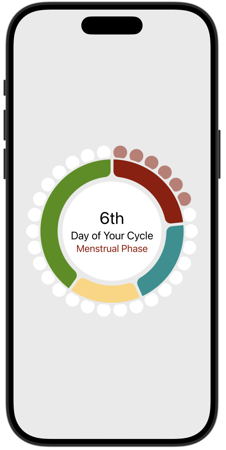
The main UI element in NourishUs is a cycle dial. It shows where a customer is in their menstrual cycle using a pie chart of phases, day markers around the perimeter, and a center info circle. Three SwiftUI views, layered in a ZStack. No single view is complicated. The composition is what makes it work.
- Swift Charts
SectorMarkdraws the phase pie chart with four colored sectors. - A custom
ShapecalledOnPathpositions small circles along a circular path to represent each day of the cycle. - View composition keeps each piece small and testable, then layers them into the final dial.
The Three Layers
The CycleDial view is a ZStack with three children: a PhaseChart view, a CycleMarkers view, and a CycleInfo view. Each one does exactly one job.
1
2
3
4
5
6
7
8
9
10
11
12
13
14
15
16
17
struct CycleDial: View {
    let cycle: Cycle

    var body: some View {
        ZStack {
            // Layer 1: Pie chart of cycle phases
            PhaseChart(cycle: cycle)

            // Layer 2: Day markers on the perimeter
            DayMarkers(cycle: cycle)

            // Layer 3: Center info circle
            CycleInfo(cycle: cycle)
                .padding(60)
        }
    }
}
Let’s break it down into each view.
Chart the Cycle Phases
Layer 1 is a donut chart to display the portion of the cycle for each phase.
1
2
3
4
5
6
7
8
9
10
11
12
13
14
15
16
17
18
19
20
struct PhaseChart: View {
    let cycle: Cycle

    var body: some View {
        Chart(cycle.phases, id: \.self) { phase in
            SectorMark(
                angle: .value("Cycle Phase", phase.length),
                innerRadius: .inset(50),
                angularInset: 3
            )
            .cornerRadius(12)
            .foregroundStyle(phase.type.color)
        }
        .overlay {
            Circle()
                .stroke(.ourBackground,
                        lineWidth: 30)
        }
    }
}
The Chart takes an array of Phase values. Each Phase has a length (number of days) and a type that determines its color. SectorMark sizes each sector proportionally. The innerRadius: .inset(50) creates the donut shape. angularInset: 1 and .cornerRadius(12) add the visual separation between sectors.
An overlay draws a circle stroke on top of the chart to create a clean ring edge where the day markers will sit:
1
2
3
4
.overlay {
    Circle()
    .stroke(.ourBackground, lineWidth: 30)
}
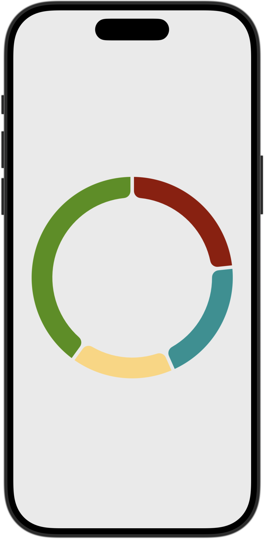
That’s the entire chart. Four phases, four sectors, sized by phase length.
Positioning Day Markers with Path
The day markers are small circles placed around the perimeter of the dial, one per cycle day. Past days are colored with their phase’s highlight color. Future days are white.
The hard part: placing shapes at evenly spaced positions along a circular path. SwiftUI doesn’t have a built-in way to do this. So I wrote (i.e. borrowed/copied from objc.io) a small Shape called OnPath and a Path extension. Thanks to Chris Eidhof and Florian Kugler for their article/video Animating along Paths.
The extension adds a point(at:) method that returns the CGPoint at any fractional position along a path:
1
2
3
4
5
6
7
8
9
extension Path {
    func point(at position: CGFloat) -> CGPoint {
        assert(position >= 0 && position <= 1)
        guard position > 0 else {
            return cgPath.currentPoint
        }
        return trimmedPath(from: 0, to: position).cgPath.currentPoint
    }
}
It works by trimming the path from start position to the desired end position and reading where the trim ends. Simple and reusable for any path, not just circles.
OnPath uses that method to position one shape along another shape’s path:
1
2
3
4
5
6
7
8
9
10
11
12
13
14
15
struct OnPath<P: Shape, S: Shape>: Shape {
    let shape: S
    let pathShape: P
    let offset: CGFloat // 0...1

    func path(in rect: CGRect) -> Path {
        let path = pathShape.path(in: rect)
        let point = path.point(at: offset)
        let shapePath = shape.path(in: rect)
        let size = shapePath.boundingRect.size
        let dx = point.x - size.width / 2
        let dy = point.y - size.height / 2
        return shapePath.offsetBy(dx: dx, dy: dy)
    }
}
It takes a shape to position (shape), a path to position it on (pathShape), and a fractional offset (0...1). It computes where that offset falls along the path shape, then centers the positioned shape on that point.
DayMarkers uses OnPath in a ForEach loop to place one circle per cycle day:
1
2
3
4
5
6
7
8
9
10
11
12
13
14
15
16
17
18
19
20
21
22
23
24
25
26
struct DayMarkers: View {
    let cycle: Cycle
    private let circle = Circle()
    private let markerSize: CGFloat = 28

    var body: some View {
        ZStack {
            ForEach(0..<cycle.length, id: \.self) { day in
                OnPath(
                    shape: Circle().size(width: markerSize, height: markerSize),
                    pathShape: circle,
                    offset: (1.0 / Double(cycle.length)) * Double(day)
                )
                .fill(day < cycle.dayInCycle
                      ? (cycle.phaseType(for: day)?.highlight ?? .inactive )
                    : .inactive)
            }
            .rotationEffect(.degrees(-84))
            .mask(
                Circle()
                    .stroke(lineWidth: markerSize)
                    .padding(-3)
            )
        }
    }
}
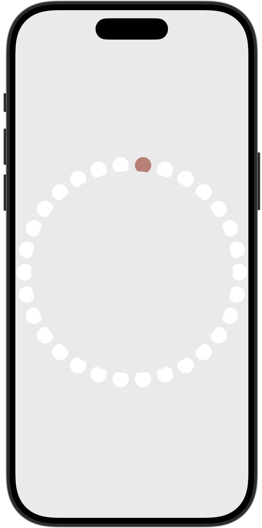
The offset for each marker is (1.0 / count) * index, spacing them evenly around the circle. The .mask chops off the lower portion of each marker for a design effect and to leave a small gap between the day markers and the phase chart. A .rotationEffect aligns path’s starting angle (3 o’clock position) with the chart’s starting angle (12 o’clock position).
The color logic is one line: if the day has passed (day < cycle.dayInCycle), use the phase highlight color. Otherwise, use .inactive.
The Center Info Circle
CycleInfo is the simplest layer. A filled circle with a text overlay showing the current day ordinal, a “Day of Your Cycle” label, and the current phase name with a tappable info icon.
1
2
3
4
5
6
7
8
9
10
11
12
13
14
15
16
17
struct CycleInfo: View {
    let cycle: Cycle

    var body: some View {
        Circle().fill(.inactive)
            .overlay {
                VStack(alignment: .center) {
                    Text((cycle.dayInCycle).ordinal ?? "")
                        .font(.headline)
                    Text("Day of Your Cycle")
                        .font(.subheadline)
                    Text("\(cycle.currentPhaseType?.title ?? "") Phase")
                        .foregroundStyle(cycle.currentPhaseType?.color ?? .menstrual)
                }
            }
    }
}
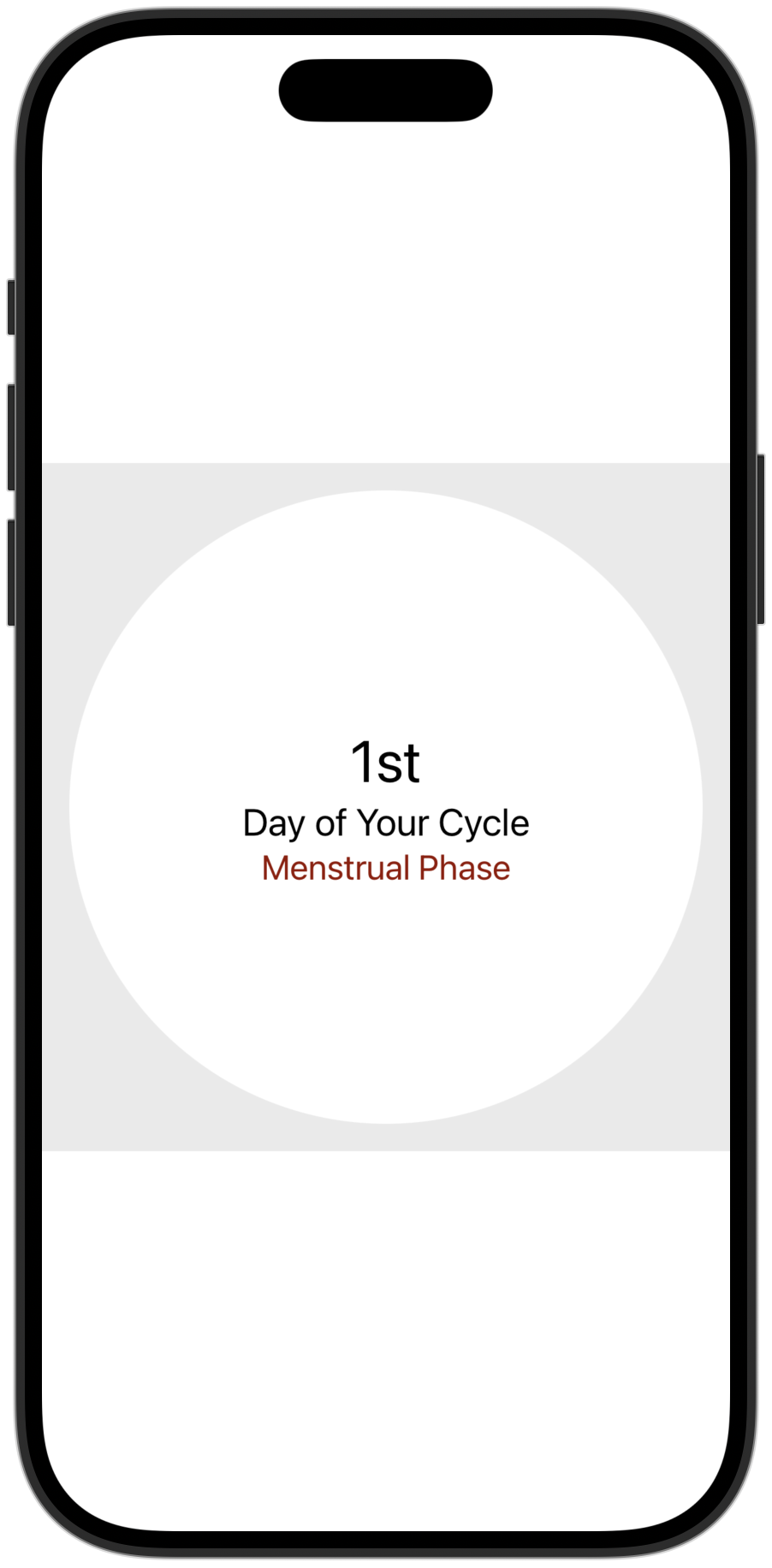
The padding on this view in CycleDial (.padding(60)) sizes it to sit inside the donut hole of the chart. No frame calculations needed. The padding does the work.
The Data Model Behind It
The Cycle struct drives everything. It takes a start date, then builds an array of Phase values. Computed properties and a function provide current dayInCycle, currentPhaseType for today, and function phaseType(for:) that returns the PhaseType for any day in the cycle. Cycle and Phase lengths use default values in this example, but these are computed using customer entered cycle sample data in the actual app.
1
2
3
4
5
6
7
8
9
10
11
12
13
14
15
16
17
18
19
20
21
22
23
24
25
26
27
28
29
30
31
32
33
34
35
36
37
38
39
40
41
42
43
44
45
46
47
48
49
50
51
struct Cycle {
    let start: Date
    let length: Int
    let phases: [Phase]

    init(start: Date = .now) {
        self.start = start.startOfDay
        let mPhase = Phase(length: PhaseType.menstrual.defaultLength,
                           startDayInCycle: 0,
                           type: .menstrual)

        let fPhase = Phase(length: PhaseType.follicular.defaultLength,
                           startDayInCycle: mPhase.length,
                           type: .follicular)

        let oPhase = Phase(length: PhaseType.ovulation.defaultLength,
                           startDayInCycle: fPhase.startDayInCycle + fPhase.length,
                           type: .ovulation)

        let lPhase = Phase(length: PhaseType.luteal.defaultLength,
                           startDayInCycle: oPhase.startDayInCycle + oPhase.length,
                           type: .luteal)
        self.phases = [mPhase, fPhase, oPhase, lPhase]
        self.length = mPhase.length + fPhase.length + oPhase.length + lPhase.length
    }

    static var defaultLength: Int {
        PhaseType.menstrual.defaultLength +
        PhaseType.follicular.defaultLength +
        PhaseType.ovulation.defaultLength +
        PhaseType.luteal.defaultLength
    }

    var dayInCycle: Int {
        start.daysSince + 1
    }

    var currentPhaseType: PhaseType? {
        phaseType(for: dayInCycle)
    }

    func phaseType(for day: Int) -> PhaseType? {
        for phase in phases {
            if phase.range.contains(day) {
                return phase.type
            }
        }

        return nil
    }
}
PhaseType is an enum with four cases (menstrual, follicular, ovulation, luteal). Each case provides its own color, highlight color, default length, and description text. The chart reads phase.length. The markers read phaseType(for: day). The center info reads currentPhaseType. One model, three views, zero duplication.
What Makes This Work
Three things:
Each view has one job. CycleDial composes. The Chart draws sectors. CycleMarkers draws day dots. CycleInfo shows text. None of them know about each other. You can preview, test, and iterate on each one independently.
OnPath is generic and reusable. It doesn’t know anything about cycles. It positions any Shape along any other Shape’s path. I could use it tomorrow for a progress ring, a clock face, or a radial menu.
The data model does the thinking. Cycle computes phase boundaries, day-to-phase mappings, and the current day. The views just read properties. No view-level math, no derived state calculations in the body.
Try It Yourself
Find the self-contained sample project with the Cycle Dial and its supporting types in a standalone repo.
Next post: I’ll be writing about how NourishUs integrates with HealthKit to read cycle data while keeping everything on-device.